How Colors Affect Mood: Psychologist Insights
Color surrounds us every moment of every day, yet most of us rarely pause to consider its profound influence on our emotional landscape. From the energizing warmth of sunrise to the calming embrace of twilight, hues shape how we feel, think, and navigate our world. Psychologists and neuroscientists have spent decades unraveling the intricate connections between color and mood, revealing that what we perceive as simple aesthetic preference is actually a complex interplay of biology, psychology, and cultural conditioning.
Whether you’re redesigning your living space, choosing an outfit for an important meeting, or simply seeking to understand yourself better, grasping the science behind mental health color psychology can transform how you approach wellness. This comprehensive guide explores the fascinating research that explains why certain colors uplift us while others ground us, and how you can intentionally harness chromatic power to support your emotional wellbeing.
Understanding color psychology isn’t just intellectually interesting—it’s practically transformative. As someone interested in health and wellness gifts or exploring health science careers, you’ll discover that color awareness has become central to contemporary wellness design and mental health interventions.
Table of Contents
- The Science Foundation: How Color Reaches Your Brain
- Individual Colors and Their Emotional Impacts
- Personal Responses and Cultural Variations
- Practical Applications for Daily Life
- Designing Your Home Environment
- Color in Workplace Wellness
- Building Careers in Color Psychology
- Frequently Asked Questions
The Science Foundation: How Color Reaches Your Brain
Before we explore individual colors and their emotional signatures, it’s essential to understand the biological mechanism that makes color psychology possible. When light enters your eye, it stimulates specialized cells called cones, which detect different wavelengths and send signals directly to your brain. This isn’t merely a visual process—it’s deeply connected to your limbic system, the ancient part of your brain responsible for emotion and memory.
Researchers at leading universities have discovered that colors trigger the release of neurotransmitters and hormones that directly influence mood. The American Psychological Association documents how chromatic stimuli activate specific neural pathways associated with pleasure, calm, alertness, or anxiety. This explains why you might instinctively feel energized in a yellow room or relaxed in a blue space—your brain is responding to evolutionary and developmental cues encoded over millennia.
The circadian rhythm connection deserves special attention. Blue light, particularly in the morning, signals your brain to suppress melatonin production and increase cortisol, naturally boosting alertness and mood. Conversely, warm colors and dimmed lighting in evening hours support your body’s natural wind-down process. This understanding has revolutionized approaches to mental health awareness and therapeutic environments.
Color psychology also intersects with cultural learning and personal experience. Your individual response to a particular shade is influenced by memories, associations, and cultural meanings you’ve absorbed throughout your life. A red dress might evoke confidence in one person and anxiety in another, depending on their unique psychological history.
Individual Colors and Their Emotional Impacts
Red: Energy, Passion, and Stimulation
Red is the color of intensity. Psychologically, it increases heart rate, blood pressure, and breathing—a physiological response linked to its association with danger and survival. In moderate doses, red energizes and motivates, making it ideal for spaces where you need to feel activated and courageous. However, prolonged exposure to intense red can increase anxiety and agitation, which is why hospitals rarely paint entire rooms this color.
Red works beautifully as an accent color in home offices or workout spaces. It’s the choice of people seeking to project confidence and assertiveness. In health and wellness jobs, understanding red’s stimulating properties helps practitioners create appropriate environments for different therapeutic goals.
Blue: Calm, Trust, and Contemplation
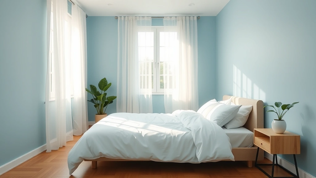
Blue is perhaps the most universally calming color. Research consistently shows that blue reduces stress hormones and promotes relaxation. It’s associated with sky and ocean, invoking feelings of safety and expansiveness. Blue rooms lower blood pressure and heart rate, making it ideal for bedrooms, meditation spaces, and therapeutic environments.
Different shades offer different psychological effects. Pale blues feel serene and spacious, while deep navy blues convey stability and trust. This is why blue dominates corporate branding and why healthcare facilities frequently incorporate it into their design schemes.
Green: Balance, Renewal, and Healing
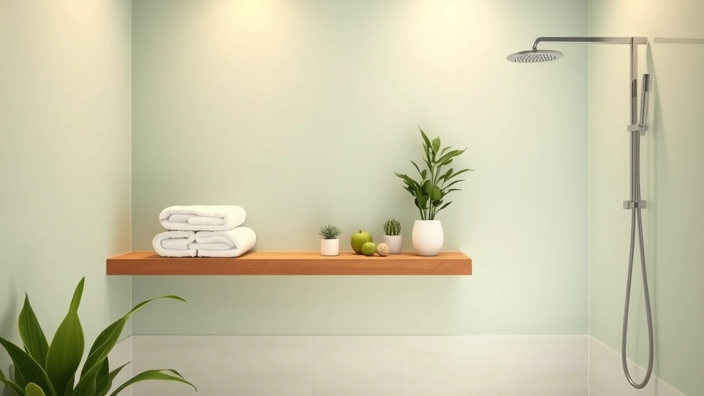
Green represents nature’s restorative power. Psychologically, it’s associated with growth, renewal, and harmony. Research shows that viewing green spaces and green colors reduces stress and promotes healing—a phenomenon so well-established that hospitals increasingly incorporate plants and green walls into patient recovery areas.
Green’s balancing quality makes it exceptionally versatile. It’s neither stimulating nor sedating; instead, it creates equilibrium. This makes green an excellent choice for spaces where you want to feel grounded yet productive. The biophilic design movement—which emphasizes our innate connection to nature—heavily relies on green’s psychological benefits.
Yellow: Optimism, Creativity, and Joy
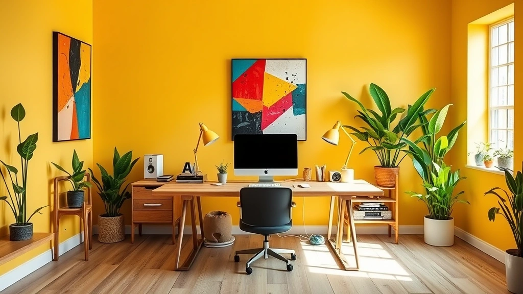
Yellow is the color of sunshine and happiness. It stimulates mental activity and creativity while promoting optimism and emotional resilience. Bright yellows energize and uplift, making them excellent for creative spaces, kitchens, and areas where you want to cultivate positive energy.
However, yellow requires careful calibration. Overly bright or saturated yellows can become overwhelming or irritating, potentially increasing anxiety rather than alleviating it. Softer, buttery yellows offer warmth without overstimulation, making them ideal for bedrooms or living areas where you want gentle encouragement rather than intense activation.
Purple: Creativity, Spirituality, and Introspection
Purple combines the stimulation of red with the calm of blue, creating a color associated with creativity, spirituality, and introspection. Lighter purples and lavenders promote relaxation and contemplation, while deeper purples evoke luxury and mystery. Purple is often chosen by people seeking to balance active creativity with peaceful reflection.
Orange: Enthusiasm, Warmth, and Sociability
Orange occupies the middle ground between red’s intensity and yellow’s cheerfulness. It promotes enthusiasm, warmth, and social connection without red’s aggressive edge. Orange encourages communication and playfulness, making it excellent for social spaces and areas designed for creative collaboration.
Pink: Compassion, Calm, and Nurturing
Soft pink, particularly in its paler forms, is profoundly calming. Research has shown that exposure to specific shades of pink can reduce aggressive impulses and promote feelings of compassion and nurturing. This discovery led to the controversial “Baker-Miller pink” being used in some correctional facilities.
Black: Sophistication, Mystery, and Formality
Black conveys sophistication and formality, but in excess can feel oppressive or depressing. Used as an accent or in balanced proportion with lighter colors, black provides grounding and elegance. In color psychology, black represents the unknown and can evoke both intrigue and unease depending on context.
White: Clarity, Purity, and Spaciousness
White promotes feelings of clarity, purity, and openness. It makes spaces feel larger and airier, reducing visual clutter and mental overwhelm. However, stark white without variation can feel clinical or cold. Warmed whites and creams maintain clarity while adding psychological comfort.

Personal Responses and Cultural Variations
While color psychology research reveals general patterns, individual responses vary significantly. Your personal color preferences are shaped by memories, cultural background, age, and individual neurobiology. A color that energizes one person might overwhelm another; what soothes someone with anxiety might feel boring to someone else.
Cultural context profoundly influences color meaning. White represents purity in Western cultures but mourning in some Eastern traditions. Red symbolizes luck and prosperity in China but danger in Western contexts. These associations are learned, not innate, which means your response to color is partly universal biology and partly cultural programming.
Personality also plays a role. Research suggests that introverts often prefer cooler, more subdued colors that feel calming and introspective, while extroverts frequently gravitate toward warmer, more saturated colors that feel energizing and social. Understanding your own color preferences can provide insight into your emotional needs and personality structure.
Seasonal variations affect color psychology too. During winter, people often crave warmer colors and brighter yellows to combat seasonal affective disorder. Summer invites cooler blues and greens that feel refreshing and grounding.
Practical Applications for Daily Life
Understanding color psychology empowers you to make intentional choices that support your mental health and emotional wellbeing. Here are evidence-based strategies for applying this knowledge:
- Morning activation: Expose yourself to blue light and warm colors upon waking to support natural cortisol release and mental alertness
- Stress management: Create dedicated spaces with blues and greens for meditation, journaling, or quiet reflection
- Creative work: Use yellows, oranges, and purples in spaces where you need to generate ideas and think innovatively
- Social connection: Incorporate warm oranges and reds in gathering spaces to encourage communication and warmth
- Sleep support: Transition evening environments toward warm tones and dimmed lighting to support melatonin production
- Workout motivation: Use reds and bright oranges in exercise spaces to stimulate energy and intensity
- Anxiety reduction: Choose soft blues, greens, and pale pinks for environments where you want to feel safe and calm

Designing Your Home Environment
Your home is your sanctuary, and color choices here have outsized impact on daily mood and wellbeing. Consider each room’s purpose when selecting your palette:
Bedrooms benefit from cool, muted tones—soft blues, greens, lavenders, and warm grays. These colors support relaxation and sleep quality. Avoid bright reds and intense oranges that can interfere with rest.
Living rooms
Home offices
Kitchens
Bathrooms
Rather than painting entire walls in bold colors, consider using color strategically through accent walls, artwork, textiles, and accessories. This approach lets you experiment and adjust without overwhelming your space or commitment.
Color in Workplace Wellness
Employers increasingly recognize that workplace color design affects productivity, creativity, and employee wellbeing. Organizations pursuing health and wellness jobs often collaborate with designers and psychologists to optimize color environments.
Open office spaces benefit from soft, neutral base colors with strategic color accents that promote focus without overstimulation. Break rooms incorporate warmer colors and plants to support mental restoration. Creative departments might use more saturated colors to stimulate innovation, while customer service areas benefit from calming blues and greens to support emotional regulation during challenging interactions.
Conference rooms designed for collaborative brainstorming use warm oranges and soft yellows. Meeting rooms for high-stakes negotiations often incorporate blues and greens to promote calm decision-making. Forward-thinking companies recognize that color psychology is an evidence-based investment in employee mental health and performance.
Building Careers in Color Psychology
If color psychology fascinates you, consider that health science careers increasingly incorporate this knowledge. Environmental psychologists, interior designers, healthcare architects, and wellness consultants all draw on color psychology research.
Community health worker jobs benefit from understanding how environmental design—including color—impacts health outcomes. Organizations focused on mental health, stress reduction, and holistic wellness actively seek professionals who understand the connection between chromatic environments and psychological wellbeing.
For more career exploration in this space, visit the Life Haven Daily Blog for ongoing insights about wellness-focused professional paths and emerging opportunities in behavioral health design.
Academic programs in environmental psychology, design psychology, and health sciences increasingly offer coursework in color psychology. Research positions in neuroscience and psychology labs continue investigating the mechanisms by which color influences cognition and emotion, creating exciting opportunities for scientifically-minded professionals.
Frequently Asked Questions
Can color psychology really affect my mood, or is it just placebo?
Color psychology involves both measurable physiological responses and psychological associations. While some effects are culturally conditioned (and thus could be considered psychological), others are neurobiological—blue light genuinely affects your circadian rhythm and hormone production regardless of belief. The most accurate answer is “both.” Your brain responds to color through multiple mechanisms simultaneously, making the effect very real whether you’re consciously aware of it or not.
What if my favorite color doesn’t match color psychology recommendations?
Personal preference and psychological theory don’t always align, and that’s perfectly fine. Your favorite color likely has positive associations in your memory or personality. If you love intense red but find it overstimulating in large doses, use it strategically as an accent. The goal isn’t to override personal preference but to understand the psychological dimensions of color so you can make intentional choices aligned with your goals.
Can color therapy treat depression or anxiety?
Color therapy is a complementary tool, not a primary treatment. While optimizing your color environment can support mood and wellbeing, clinical depression and anxiety disorder require professional mental health treatment. However, using color psychology as part of a comprehensive wellness approach—alongside therapy, medication if needed, exercise, and social connection—can meaningfully enhance your overall wellbeing and recovery.
How quickly does color affect mood?
Some effects are immediate. Your pupils dilate in response to certain colors within seconds; your nervous system responds to blue light’s calming properties relatively quickly. However, the full psychological impact of a color environment develops over time as your brain and body acclimate. You might feel an initial response to walking into a blue room, but the sustained calming effect deepens over hours and days of exposure.
Are there colors I should avoid?
No single color is universally “bad,” but certain colors in certain contexts can be problematic. Intense, saturated reds in large doses can increase anxiety. Dingy, desaturated colors everywhere can feel depressing. The key is balance, context, and personal response. A small amount of red can energize; an entire room of intense red might overwhelm. Pay attention to how different colors make you feel and adjust accordingly.
How does color psychology apply to digital environments?
Your phone, computer, and tablet screens emit light that affects your nervous system similarly to physical color environments. The blue light from screens stimulates alertness, which is why late-night screen time interferes with sleep. Using dark mode or blue light filters in evening hours supports your natural circadian rhythm. Additionally, the colors used in app interfaces and websites affect user experience and emotional response—another reason why major tech companies invest heavily in color psychology research.
Can I use color psychology to improve my productivity?
Absolutely. Soft blues support focused concentration without fatigue. Warm yellows encourage creative thinking. Greens provide balanced energy. The key is matching color to your specific task and personal response. Experiment with different color environments for different types of work, tracking your productivity and how you feel. You’ll likely discover personal color-productivity relationships that you can then optimize.
What about color combinations and palettes?
Color combinations matter significantly. Complementary colors (opposite on the color wheel) create visual interest and energy. Analogous colors (adjacent on the wheel) feel harmonious and cohesive. Monochromatic palettes feel sophisticated but can become monotonous. When designing your environment, consider not just individual colors but how they interact. A balanced palette typically includes a dominant color, a secondary color, and accent colors that create visual interest without overwhelming the senses.
Color psychology represents an evidence-based bridge between interior design, neuroscience, and mental health support. By understanding how hues influence your emotional landscape, you gain agency over your environment and wellbeing. Whether you’re painting a room, choosing clothes, or simply becoming more aware of color’s influence on your daily experience, this knowledge empowers you to create spaces and make choices that genuinely support your mental health and happiness.
Explore more wellness insights and career opportunities on the Life Haven Daily Blog, where we regularly discuss the intersection of psychology, design, and holistic wellbeing.
